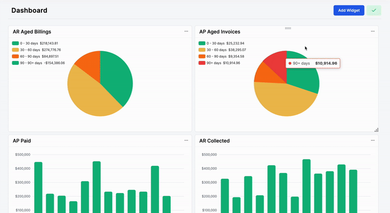
Building SaaS applications often times can be challenging because every client might need one or multiple pages tailored to their specific needs. A common example in this direction are dashboard pages with various charts and quick actions. Perhaps one client wants lots of charts and information being displayed, while someone else would be fine with less information being displayed but ordered in a particular way. I’m pretty sure that you’ve already noticed such features in many widely used platforms Such as Stripe, Google Analytics, Pendo and many other SaaS products.
At BinarCode we specialize in building SaaS applications for various clients and building interactive, editable dashboards is a commonly requested feature. I would like to share with you how something like this can be implemented with Vue.js and Tailwindcss, however the concept is the same and will apply to any framework as long as you understand the fundamentals. Here’s an example to get an idea of what I’m talking about
Planning & Research
Before diving into more details, let’s try to analyze what is needed in order to implement something like this based on similar examples from the web.
- Define widget components (e.g charts, cards etc)
- Drag and drop widgets
- Ability to re-order widgets
- Ability to resize widgets
- Add, remove or edit existing widgets
- Layout re-arrangement after resize or widget drag and drop
- Save/Restore layouts
While this seems to be quite overwhelming and if we were to implement this from scratch it could take ages to do, we now at least know what we need and perhaps find a good library that could handle many if not most of the features mention above. After looking at several DnD (drag and drop) libraries we will highlight a few of them and list the benefits and downsides for each of them.
- VueUse VueUse is a wonderful collection of utilities and composable functions including composables such as useDraggable and useResizeObserver however for our particular use case these utilities would be quite low level and we will need to connect many dots and take care of things such as making the widgets aware of each other, handle swap zones and many other details which will take quite a lot of time.
- SortableJS or Shopify Draggable SortableJS is a great general purpose drag and drop library which handles a good chunk of the features we need. We’ve covered an integration with Vue.js and SortableJS in a past article. SortableJS works very well for lists, tables, kanban boards, multiple selections with drag and drop and other features where the drag and drop is the fundamental thing you need. It handles swap zones, collisions and other features related to drag and drop. However, one really important thing for us is the ability to resize widgets and while we do that, the whole layout should re-adjust as we resize. With both SortableJs and Shopify Draggable we would have to implement that manually.
- Gridstack.js Gridstack.js is more of a high level library specifically designed for creating interactive drag and drop layouts. Although the website looks rather old and it mentions jquery in it, it handles pretty much everything we need and is very well maintained having regular releases from 2014 for more than 8 years! This is quite an amazing feat, especially in open source.
Based on the list above, it’s quite obvious that Gridstack.js handles most of the things we need and that’s was the library of choice for us at BinarCode for several projects, however we might be biased, so feel free to use something else that you think is suitable for you or your company and covers the capabilities you need.
Initial Prototype
In order to validate our initial assumptions we would like to implement a very simple prototype with a grid, some very basic empty widgets and be able to resize and reorder them. We will use Vue.js 3, Tailwind CSS and CodeSandbox for our prototype, however Gridstack.js is a pure JS library and is framework agnostic. The same principles would apply without Vue.js or with another UI library/framework.
Before starting the prototype, I would like to mention that Gridstack has some very specific quirks on how things should be initialized. In their documentation you will see a lot of example on how to initialize everything from the Javascript side including the widget contents, however we want more control over the process and therefore we’ll have to do a few things manually in order to achieve maximum flexibility.
Basic Gridstack example
// ...in your HTML
<div class="grid-stack"></div>

// ...in your script
const grid = GridStack.init();
grid.addWidget({w: 2, content: 'item 1'});
In the most simple form, there are 2 key parts in order to initialize a grid with gridstack
-
Have an HTML element with the grid-stack class
-
Add the so called widgets. Each widget can have several properties such as
- w - Width (specified in columns)
- h - Height (specified in columns)
- x - X axis coordinate (specified in columns)
- y - Y axis coordinate (specified in columns)
- content - HTML content of the widget
With widgets and these key properties we can already create grids and control where exactly is each widget place. Now you might be asking yourself, if these properties specify coordinates and width, heights of widgets, how can they be responsive ? The answer to that is that each property is specified in columns and not in absolute values like pixels. By default Gristack uses a 12 column layout but we can change that number when initializing the grid. Above that we can control the cell height, therefore having a responsive way of specifying widths at least. For example
// ...in your script
const grid = GridStack.init({
   column: 4,
   cellHeight: 100,
});
In the example above we specify that our grid has 4 columns. Therefore if we were to have a widget like this
const widget = {
  x: 0,
  y: 0,
  w: 2,
  h: 2,
}
This particular widget will start from the top left of our container element and will have a 50% width and 200px height
const widget2 = {
  x: 2,
  y: 0,
  w: 1,
  h: 1,
}
The second widget will start at the 50% of the container and have a 25% width and 100px height.
Now that you get the idea how Gridstack and it’s coordinate system works, we can go ahead and implement our Vue.js prototype.
Vue.js example
The principles are the same however the way we declare widgets and coordinates will be slightly different. So let’s start
Defining sample widgets
First, we have to create a few sample widgets to play with. We will extract all the Gridstack related properties in a nested object called grid for each widget so it’s easier to understand which are our custom properties and which are Gridstack related properties
const widgets = ref([
{
id: 1,
title: "First Widget",
grid: {
x: 0,
y: 0,
w: 2,
h: 2,
},
},
{
id: 2,
title: "Second Widget",
grid: {
x: 2,
y: 0,
w: 2,
h: 1,
},
},
{
id: 3,
title: "Third Widget",
grid: {
x: 0,
y: 2,
w: 2,
h: 1,
},
},
{
id: 4,
title: "Fourth Widget",
grid: {
x: 2,
y: 2,
w: 1,
h: 2,
},
},
{
id: 5,
title: "Fifth Widget",
grid: {
x: 3,
y: 2,
w: 1,
h: 2,
},
},
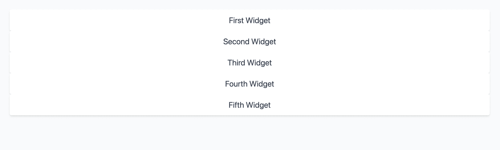
]);Rendering the widgets
The next step would be to render our widgets and prepare for initializing the grid.
Before initializing the grid, we have to define our widgets in the html. Since we’re using Vue.js, we can just iterate over them and display them on the screen first. We’re going to use TailwindCSS. If you don’t know how to get started with it, check out the installation docs
Our Vue component will look like this. It’s a v-for iteration over the defined widgets plus some very basic styling
<template>
 <div class="p-8 bg-gray-50 min-h-screen">
    <div class="grid-stack">
      <div
        v-for="widget in widgets"
        :key="widget.id"
        :id="widget.id"
        :gs-id="widget.id"
        :gs-x="widget.grid.x"
        :gs-y="widget.grid.y"
        :gs-w="widget.grid.w"
        :gs-h="widget.grid.h"
      >
        <div
          class="grid-stack-item-content p-4 bg-white rounded-md shadow-md flex items-center justify-center text-gray-700"
        >
          <span class="text-2xl">
            {{ widget.title }}
          </span>
        </div>
      </div>
    </div>
  </div>
</template>
<script setup>
  const widgets = ref([
     // See code snippet above for the widgets
  ])
</script>
Which should give us the following output
They are some important subtleties in the code above that will play an important role when we initialize the grid in a few moments.
- class=“grid-stack” Without this class Gridstack won’t work. By default it uses the .grid-stack query selector to initialize the grid.
- :id=“widget.id” :gs-x=“widget.grid.x” We have to specify a few attributes via HTML directly so Gridstack will know what are the widget properties. Normally, if you define the widgets via Javascript only, you don’t have to do this, however our initialization flow will be the following Javascript -> Vue.js -> Rendered HTML -> Gridstack. For Gridstack the source of truth will be the rendered HTML and therefore we need to make those attributes available so it know where to render each widget and the size of it.
- class=“grid-stack-item-content This will also play an important role in our code as this class is responsible for the margins and spacing between each widget.
Initializing the grid
Now that we have our widgets defined, we can initialize our grid. First we need to import Gridstack and 2 css files associated with it. You can read more here on why we need both css files.
import { GridStack } from "gridstack";
import "gridstack/dist/gridstack.min.css";
import "gridstack/dist/gridstack-extra.min.css";
Next, we need to define a variable for our grid and initialize it when our Vue component mounts.
const grid = ref(null);

function initGridStack() {
  grid.value = GridStack.init({
    column: 4,
    cellHeight: 100,
    minRow: 1,
    margin: 10,
  });
}

onMounted(() => {
  initGridStack();
});
We are initializing our grid inside the onMounted lifecycle hook and define a few grid options during the initialization. Gridstack has a bunch of options available which you can find in their docs, however we will use only a few to start with.
- columns - As explained above defines how many columns our grid has. We will go with 4 columns
- cellHeight - Also as mentioned above, this defines the height of 1 unit in Gridstack. This is the value multiplied by y and h values for each widget. For example cellHeight: 100 and h: 5 will result in a height of 500px.
- minRow - This is more of a helper option. When the grid is empty and has now widgets, it will have a minimum number of rows. In our case it will have 1 row of 100px.
- margin - This is the spacing between widgets. Actually the default value is 10px already but it’s worth mentioning it because this is how you control the spacing between widgets. Not that the margin won’t work without class=“grid-stack-item-content”. This is why it’s very important to define all the styles such as background, shadows etc at the level where the grid-stack-item-content class is specified, otherwise the widgets won’t have spacing between them.
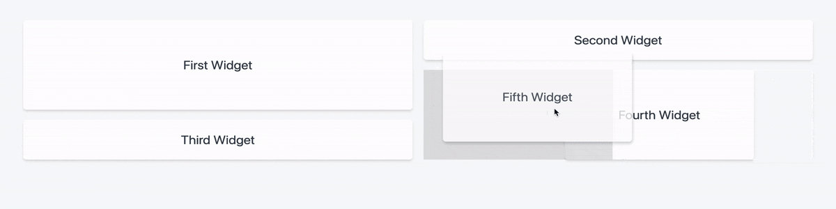
All of this is great, but our widgets still look like this after adding the code above
This is because we didn’t actually tell the grid to initialize the widgets. We initialized the grid, but didn’t actually initialize the widgets as well.
To do this, we have to go over our widgets at tell the grid which is the html element for each widget so it can initialize it.
We will have 2 small functions for that
function makeWidgets(widgets) {
  widgets.forEach((widget) => {
    makeWidget(widget);
  });
}
function makeWidget(item) {
  const elSelector = `#${item.id}`;
  return grid.value.makeWidget(elSelector);
}
The key line of code is grid.value.makeWidget(elSelector) which initializes each widget
Our full script part should look like this now
<script setup>
import { ref, onMounted } from "vue";
import { GridStack } from "gridstack";
import "gridstack/dist/gridstack.min.css";
import "gridstack/dist/gridstack-extra.min.css";
const grid = ref(null);
const widgets = ref([
{
id: 1,
title: "First Widget",
grid: {
x: 0,
y: 0,
w: 2,
h: 2,
},
},
{
id: 2,
title: "Second Widget",
grid: {
x: 2,
y: 0,
w: 2,
h: 1,
},
},
{
id: 3,
title: "Third Widget",
grid: {
x: 0,
y: 2,
w: 2,
h: 1,
},
},
{
id: 4,
title: "Fourth Widget",
grid: {
x: 2,
y: 2,
w: 1,
h: 2,
},
},
{
id: 5,
title: "Fifth Widget",
grid: {
x: 3,
y: 2,
w: 1,
h: 2,
},
},
]);
function initGridStack() {
grid.value = GridStack.init({
column: 4,
cellHeight: 100,
minRow: 1,
margin: 10,
});
makeWidgets(widgets.value);
}
function makeWidgets(widgets) {
widgets.forEach((widget) => {
makeWidget(widget);
});
}
function makeWidget(item) {
const elSelector = `#${item.id}`;
return grid.value.makeWidget(elSelector);
}
onMounted(() => {
initGridStack();
});
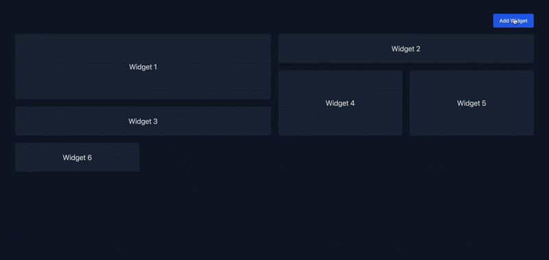
</script>Now our grid finally starts to look much better. At this point we already have a fully functional grid which includes
- Widget positioning (according to specified w,h,x,y properties)
- Widget resizing
- Widget reordering
- Layout adjustments after resizing or reordering
- Equal spacing between widgets.
- A bunch of other defaults from Gridstack
You check the full code as well as some cleanups in the CodeSandbox here
Adding & removing widgets
Our grid already looks great, however we want to be move flexible and be able add & remove widgets from it.
We will start with adding widgets. Having the setup already, this is actually not that hard to do. We just have to do the following
- Define the widget
- Add it to our widgets array
- Wait for Vue to render it
- Initialize it by calling makeWidget function
Our addWidget function looks like this
async function addWidget() {
  const widgetCount = widgets.value.length + 1;
  const widget = {
    id: widgetCount,
    title: `Widget ${widgetCount}`,
    grid: {
      w: 1,
      h: 1,
    },
  };
  widgets.value.push(widget);
  await nextTick();
  makeWidget(widget);
}- We defined our widget via widget variable. Not that we don’t specify x,y here. If we don’t specify them, Gridstack will add our widget at the end automatically. If we want to explicitly add it on the top left for example, we can specify x: 0, y: 0
- widgets.value.push(widget); Adds it to our array. This will trigger a Vue re-render of the list
- await nextTick(); After changing an array or reactive variable in the Javascript, Vue won’t render it right away. For our use case we need to call makeWidget with an existing HTML element, therefore we use await nextTick() to wait for Vue to render the changes we made to the widgets array. After this line we will have for sure the HTML element of the newly added widget, therefore be able to initialize it.
- makeWidget(widget); We tell gridstack to initialize the newly added widget with the predefined configuration w: 1, h: 1
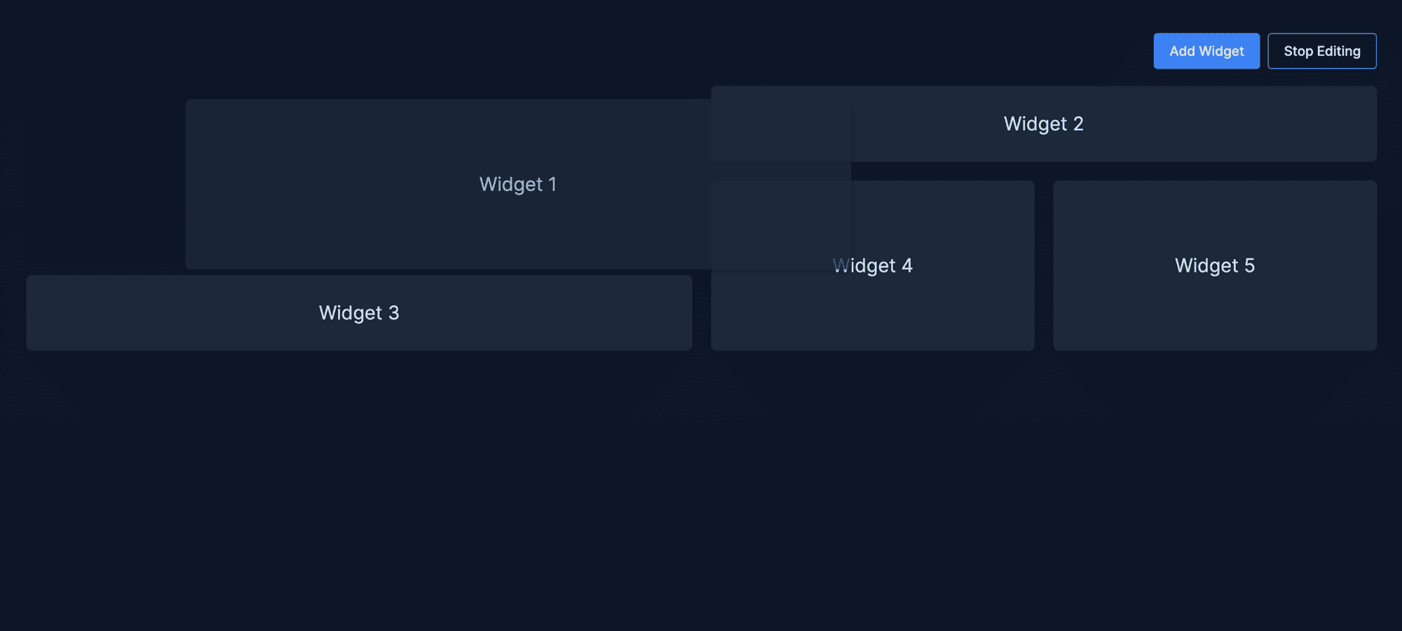
Check out the result below. Looks pretty cool, right ?
To remove widgets, the process is quite similar, however we have to remove the widget from the grid before removing it from our widgets array.
- Remove widget from the grid
- Remove widget from the widgets array
function deleteWidget(widget) {
  const index = widgets.value.findIndex((w) => w.id === widget.id);
  if (index === -1) {
    return;
  }
  const selector = `#${CSS.escape(widget.id)}`;
  grid.value.removeWidget(selector);
  widgets.value.splice(index, 1);
}
In this case we call removeWidget first. You will notice a strange CSS.escape in the code. That is because we were using numeric ids 1, 2, 3 etc and document.querySelector complains about having a css selector like #1 for example, therefore we need to escape it in order for it to work. Alternatively we can use ids that start with letters.
Additionally we can also use the Gridstack compact function which re-arranges the layout in case we want to re-arrange the layout after deleting a widget.
Enable & disable edit mode
All of the above is great, but in a real world application we want our dashboards to not be editable by default. Perhaps we only have permissions so only certain users can edit the widgets or remove them. Luckily Gridstack provides a few initialization options as well as 2 functions
With these 2 functions + some initialization properties we can implement this functionality.
We need a variable to tell us if we’re in edit mode or not and then use it during initalization.
const isEditing = ref(false);

function initGridStack() {
  grid.value = GridStack.init({
    column: 4,
    cellHeight: 100,
    margin: 10,
    disableResize: !isEditing.value,
    disableDrag: !isEditing.value,
  });
}
Notice that we’ve added 2 more properties disableResize and disableDrag. If set to true, these will disable the resize and dragging when initializing the grid, however the grid will still be initialized based on the coordinates of each widget. In essence this is our read only mode.
Now we need a button to handle the enable/disable
// In template
<Button @click="toggleEdit" outline>
  {{ isEditing ? "Stop Editing" : "Start Editing" }}
</Button>

// In script
function toggleEdit() {
  if (isEditing.value) {
    grid.value.disable();
  } else {
    grid.value.enable();
  }
  isEditing.value = !isEditing.value;
}
Besides that we need to conditionally hide the other buttons (add and delete widget). Since we have the isEditing ref, it’s quite easy to do that. You can always check the full code example
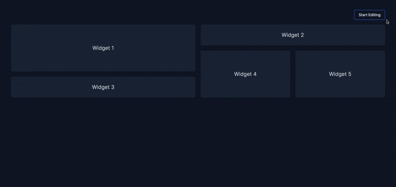
Now this is quite awesome, isn’t it ? We can now have a user defined dashboard with widgets where you can add, remove, re-order and resize widgets but at the same time have a read only mode.
Improvements and next steps
If you’ve made it this far, you’re a champ! All what we’ve discussed above is a great ground work for making a truly customizable and interactive dashboard, however as you know the devil is always in the details. There are still many things to cover here and take care of little details. Unfortunately the article is already quite long and if you’re really interested in a part 2 where we can cover the following topics (and more)
- Adding widgets from a predefined list
- Rendering dynamic widgets such as cards, charts or tables
- Defining minimum widths and heights for certain widgets
- Saving & retrieving the data
If you’re interested in a part 2 of this article, feel free to leave a comment below.
Conclusion
In this article we’ve covered how you can create an interactive dashboard with widgets. We’ve went through all the details and steps on how to setup the ground base for an editable dashboard with Vue.js and Gridstack where you can
- Define a column base layout
- Drag and drop widgets to reorder them
- Resize widgets
- Add/remove widgets
- Have an edit & read only mode
You can find a preview of what we created as well as the source code in CodeSandbox. This particular approach helped us at BinarCode to build interactive dashboards for 3 different projects and is a good ground base to expand upon and I hope the insights provided in this article will help you create interactive dashboards as well and if not, you will at least now it’s possible and it’s not that hard to do it.

Author
Cristi Jora
Shapes BinarCode's technical direction across projects as developer, consultant, and lead, with over a decade of hands-on experience. Bridges engineering and business, working directly with clients to deliver software that solves real problems.